Changing fonts can make reading easier for some, even in State Department memos
The US Department of State is shifting fonts from Times New Roman
By Jen Christensen, CNN
On Monday, the US State Department’s domestic offices, bureaus and posts overseas will begin communicating in a style that’s unlike any other they’ve ever used before: The agency will ditch Times New Roman, a font it has been using since February 2004, and switch to the plainer Calibri.
Secretary of State Antony Blinken’s email about the change was titled “The Times (New Roman) are a-Changin,” according to the Washington Post.
The new typeface came recommended by internal diversity and disability groups. There has been a growing movement to make webpages and publications more accessible, including with fonts that are easier to read for people with dyslexia or those with aging eyes.
An agency spokesperson said in an email to CNN that “The Department is committed to creating a more accessible workplace and being a public sector leader in modeling accessibility best practices.”
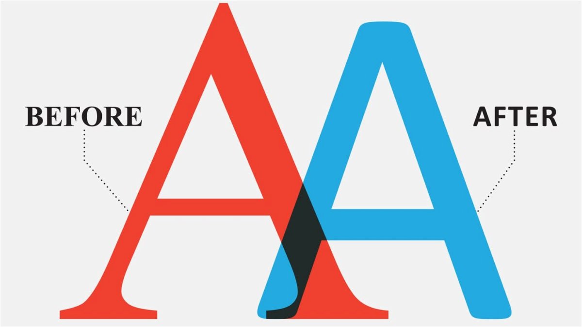
Design-wise, Times New Roman is the fussier font. Calibri is what’s known as a sans serif font, meaning it does not have little flourishes known as “wings” and “feet” on each letter like Times New Roman does. These decorative, angular serifs can create accessibility issues for some readers, experts say.
Times New Roman can be difficult for people with a visual impairment, dyslexia or learning differences who use Screen Reader or Optical Character Recognition (OCR) technology for help reading printed material. OCR that uses character recognition to identify the shapes of digits, letters and other characters, converting a scanned image into an electronic format that can be searched.
“I think one of the strengths has been that Calibri is perceived that it’s a good strong font on a screen, as well as printed clarity,” said Dr. Sarah Lewthwaite, a senior research fellow at the University of Southampton who works on font and accessibility research. “One of the big things about accessibility is trying to remove barriers to make any resource or services as accommodating as possible to the largest number of people.”
Additionally, Calibri offers a wider range of characters, so it works well with other languages, Lewthwaite said.
Times New Roman can cause some visual recognition issues for people with learning disabilities. Visual acuity also declines with age, and the clarity of a sans serif typeface can make reading easier, Lewthwaite said.
When we read, we don’t just focus on a word. We look ahead toward the next word, and the next. Sometimes, a reader will recognize shapes rather than reading every single part of the word, and they skip forward through the text.
“Typeface is important to readability, which is how easy your text is to read,” Lewthwaite said.
Reading involves a collaboration between those areas of the brain that support language and those areas of the visual system that allow the brain to recognize objects, explains Dr. Guinevere Eden, a professor in the Department of Pediatrics and director of the Center for the Study of Learning at Georgetown University, whose areas of study include the neural bases for reading. The brain actually repurposes the neurons involved in object recognition for letter and word recognition, she said.
The visual clutter of fonts with wings and feet like Times New Roman can trip a reader up and get in the way.
“Fonts that are busy, perhaps they induce crowding, and that can be a problem in terms of accessing that print,” Eden said.
Crowding is a phenomenon in which the recognition of objects — in this case letters — is impaired by the presence of neighboring objects so the reader perceives details with less clarity.
If a font is sharp enough, standing out from its background, the contrast can especially help people who have a visual impairment. More space between letters, lines and words can also help a font be readable, but there is the practical reality that people in the State Department value brevity, and adding too much space to a page may not be practical.
Lewthwaite noted that it can be difficult to distinguish between the capital letter “I” and the lowercase “l” with Calibri, and punctuation is small.
It’s also important to keep in mind that sans serif fonts like Calibri may not increase reading speed or comprehension, Eden said, and fonts don’t necessarily enable people with dyslexia to become skilled readers.
“As long as you’re not making it less accessible to anybody, you have nothing to lose, and even if a small fraction of the population benefits from it, it’s worth doing,” she said.
Lewthwaite added that a more accessible font can benefit everyone, whether you’re writing to your grandmother or a colleague.
“This is about all of us,” she said.
The State Department says that even something as simple as a change in font can be a matter of diplomacy and send an important signal to the world.
“The new font change will make the Department’s written products and communications more accessible. It demonstrates Secretary Blinken’s allyship to those with disabilities and underscores his support for employees with disabilities,” the spokesperson said in its email to CNN. “Moreover, this change underscores that the values and message of disability inclusion are not restricted to any given month or period, but something that should be pursued all year round.”
The-CNN-Wire
™ & © 2023 Cable News Network, Inc., a Warner Bros. Discovery Company. All rights reserved.