Interior design trends from the 1920s to today
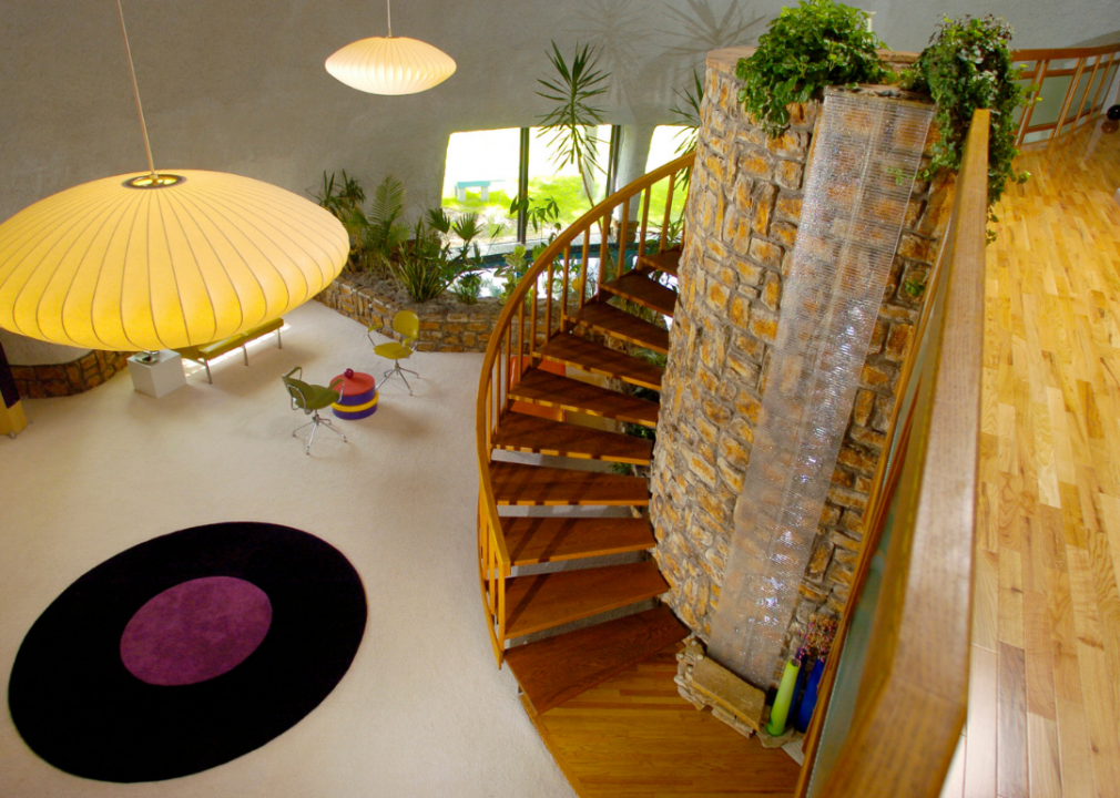
Glenn Asakawa/The Denver Post via Getty Images
Interior design trends from the 1920s to today
From the glitz and gold hues of 1920s art deco to the pink porcelain of 1980s bathrooms, interior design has run the gamut from bold to modest and back again over the last century. Design’s influence from each time period can be seen in art, film, and architecture—and inevitably trickles down into homes and everyday lifestyle choices.
Better, an online mortgage lender with a free mortgage calculator, researched notable interior design trends from every decade over the past 100 years. This information was gathered from the Museum of Modern Art, Architectural Digest, and Journal of Engineering and Architecture. Photos and stories behind these trends were also compiled to explain how American homes have transformed over the years.
Interior design trends have been heavily influenced by current events and economic trends. The 1920s were a time of prosperity and excess, which brought a more glamorous and over-the-top interior design style. The 1930s brought with them economic hardship and the precursor to a second world war, necessitating leaner times for people that translated into a more functional and practical design aesthetic in homes.
Keep reading to learn more about some of the most popular interior design trends from the past 11 decades and the historical and cultural context that inspired them.
![]()
General Photographic Agency // Getty Images
1920s: Art deco
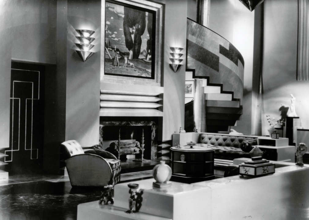
After the winding down of the 1918 flu pandemic and with the end of World War I in 1919, the world was ready for the glamour and glitz of the Roaring ’20s, and art deco, which was also known as Arts Décoratifs, provided that in spades. With its origins in France, art deco is defined by sharp lines, bold silhouettes, extravagant ornamentation, simple shapes, and geometric patterns as well as the use of bold colors like bright and deep yellows, greens, pinks, reds, and blues that are often paired with chrome, gold, silver, or black accents.
In architecture, art deco featured synthetic and industrial elements and relied heavily on materials like stucco, concrete, and steel. The design found its way into homes and was especially easy to spot in living rooms. Film set designers also reflected the trend, featuring sets that incorporated many elements of art deco. The image above is from the 1929 silent film “Our Modern Maidens” directed by Jack Conway. It included a sweeping staircase, a fireplace with straight lines, and a gold and black doorway.
Print Collector // Getty Images
1930s: Modernism
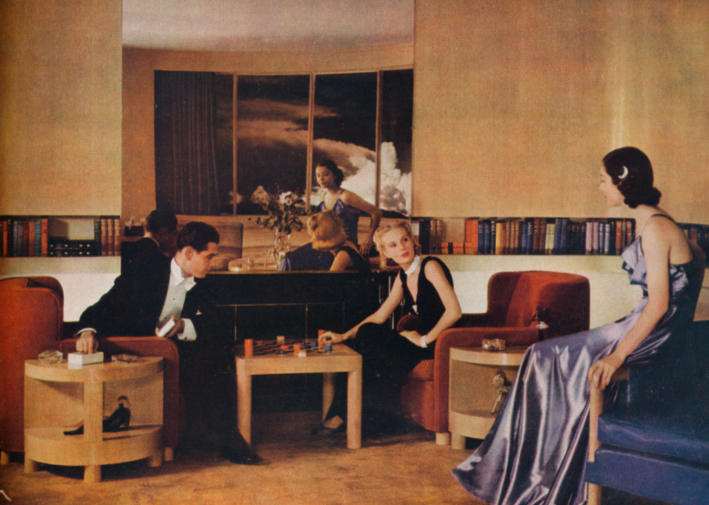
The 1930s began with the fallout from the stock market crash of 1929 and ended with the start of World War II, and the time between was marked with tightened family budgets due to the Great Depression, which would last until the end of the decade. This living room, created by designer and architect Paul MacAlister in 1938, is a perfect representation of the modernism that permeated interior design during the decade. Modernism prioritized spartan and simple design echoing the practicality and necessity born of the period.
Residences like Villa Savoye, Fallingwater, Maison de Verre, and the Lovell Health House were examples of modernism in design. Modernism featured a rejection of the ornamentation found in the preceding decade with art deco and embraced the practical use of materials, functionality in design, asymmetrical compositions, and structural innovation. Floor plans were open and featured a significant amount of interior light and modern materials. Ribbon windows, reinforced concrete, curtain walls, and steel frames were incorporated into designs.
Hedrich Blessing Collection/Chicago History Museum // Getty Images
1940s: American traditional
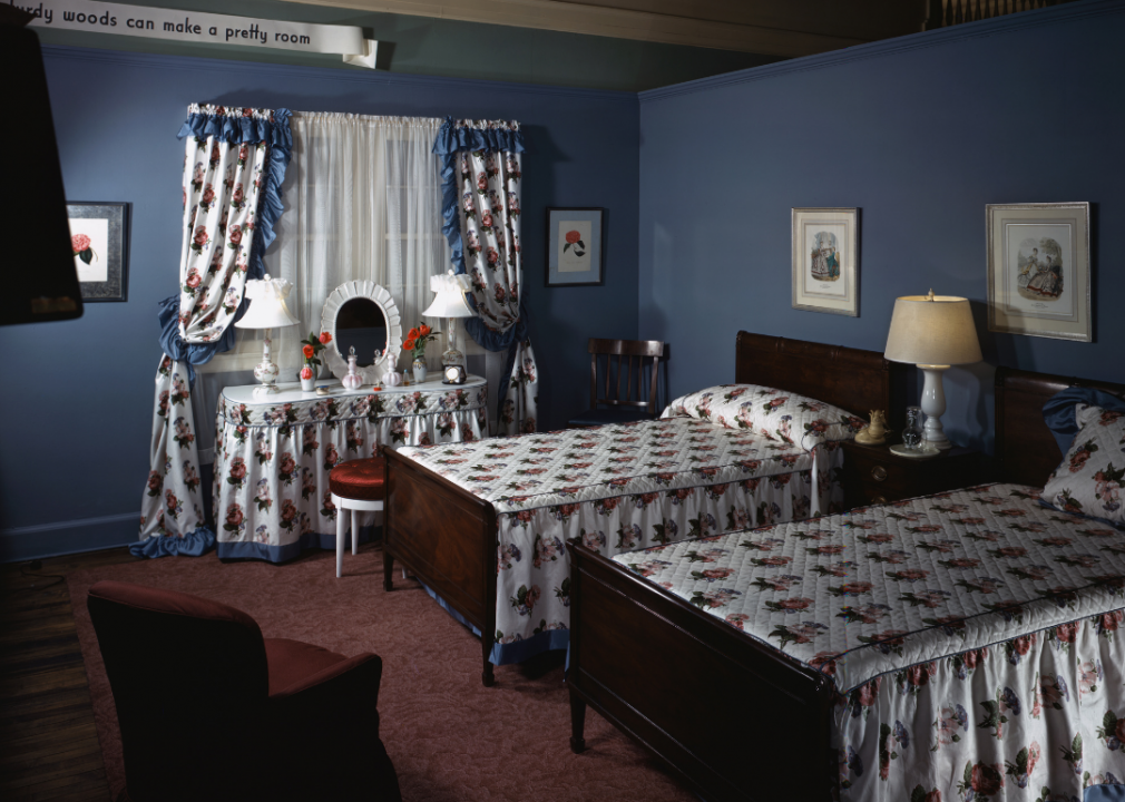
While the 1930s were defined in many ways by the Great Depression, the 1940s were defined by the second world war. All resources went to the ongoing war effort, which meant an end to nonessential items, and the first half of the decade featured supply shortages and rations. Interior design was a no-nonsense, practical, and functional endeavor. Home floor plans also reflected the practicality and functionality of design.
This furniture setting at Marshall Field & Company in Chicago, Illinois, circa Feb. 26, 1943, perfectly gathers many elements of the American traditional style with its focus on the use of basic colors and a simple floral design to tie the room together with matching curtains and bedspreads. The ruffled fabric and matching wooden twin beds speak to the innocence of the period.
Hulton Archive // Getty Images
1950s: Midcentury modern
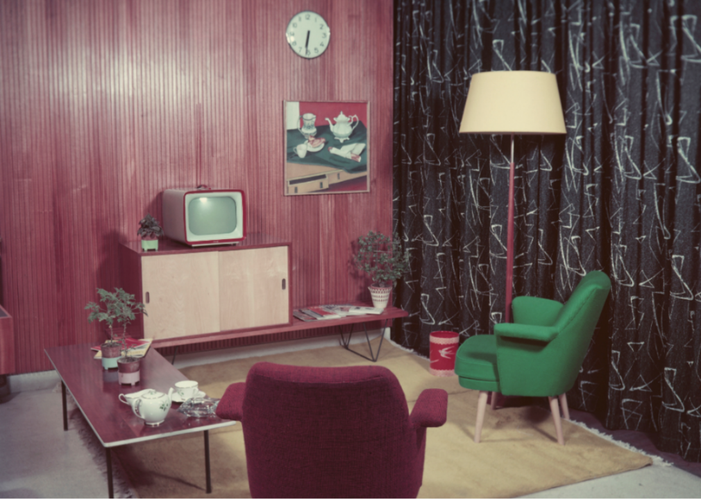
Midcentury modern (MCM) homes featured large windows to create a connection between the interior of the home and the natural world just beyond it. Frank Lloyd Wright heavily influenced and trained some of the top architects of the time like Rudolph Schindler and Richard Neutra in midcentury modern style.
This image of a dining room in Silver Spring, Maryland, in the home of Christopher Naughten, displays many of the features of a typical midcentury modern home, and it won a Washington Post “Mad Men Look” contest in 2010. MCM brought modernist design into the home and placed heavy emphasis on functionality. Interior design features include vibrant colors, clean lines, a combination of synthetic and natural materials, and organic and geometric shapes.
Zoltan Glass/ SSPL // Getty Images
1960s: Psychedelics
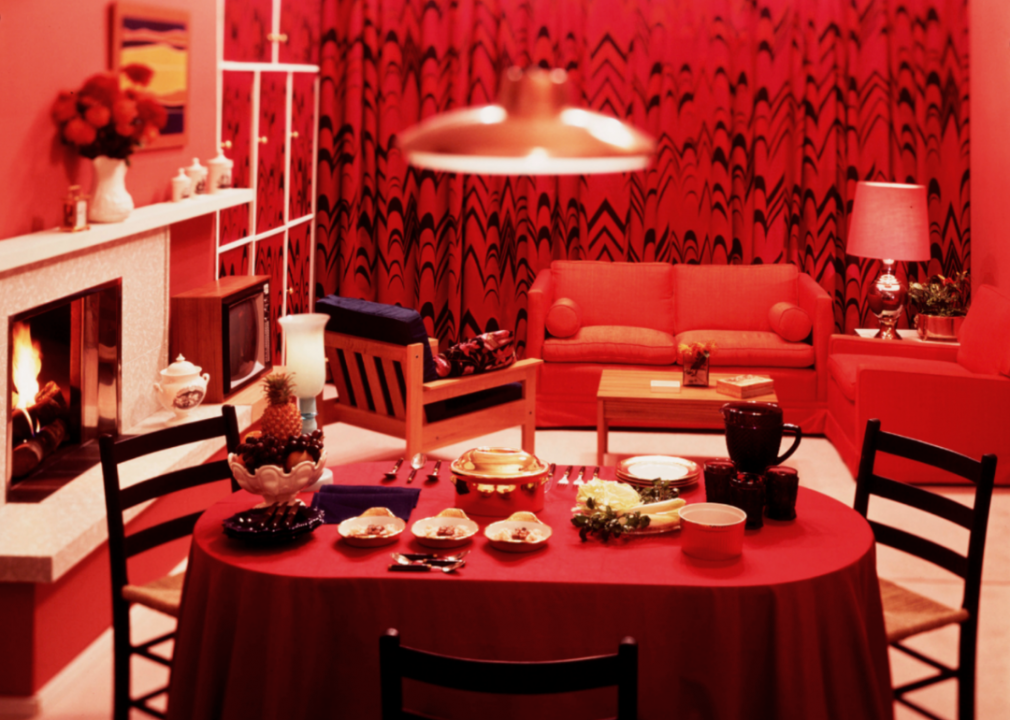
This color transparency of a dining room was taken by Zoltan Glass circa 1960 and features the bold style of the decade bathing the entire room in an intense shade of red. One of the great furniture design trends of the 1960s was using polypropylene, which is a type of thermoplastic polymer resin, to make furniture. It came in colors people could match to paint chips..
The interior design aesthetic was heavily influenced by the counterculture or hippie movement of the time. Psychedelics found their way into the home through design and offered a visually shocking alternative to the practicality of midcentury modern design. Bright and bold colors and patterns ended up on walls, furniture, floors, and ceilings.
f8 Imaging/Hulton Archive // Getty Images
1970s: Harvest gold and avocado green
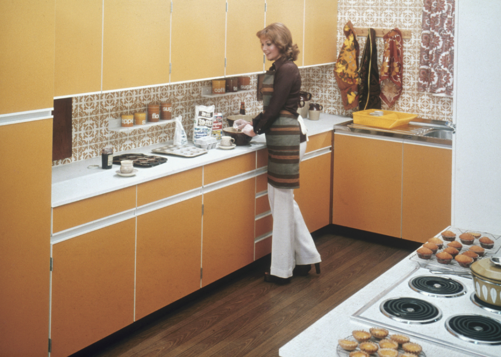
In this image, a woman bakes in her kitchen circa 1975 with its cabinets in harvest gold, one of the signature design colors of the decade.
The 1970s was about self-expression. Large windows and indoor gardens, hanging plants, wicker furniture, and avocado green appliances were some of the interior design choices of the time. Shag rugs in burnt oranges and reds and comfortable furniture could be found in casual dens and rec rooms. Living rooms were either accessed by several steps leading down or featured massive fireplaces in natural materials like stone that climbed from floor to ceiling. Split-level and single-story ranch homes became popular styles in the 1970s.
Frederic Lewis // Getty Images
1980s: Pastels
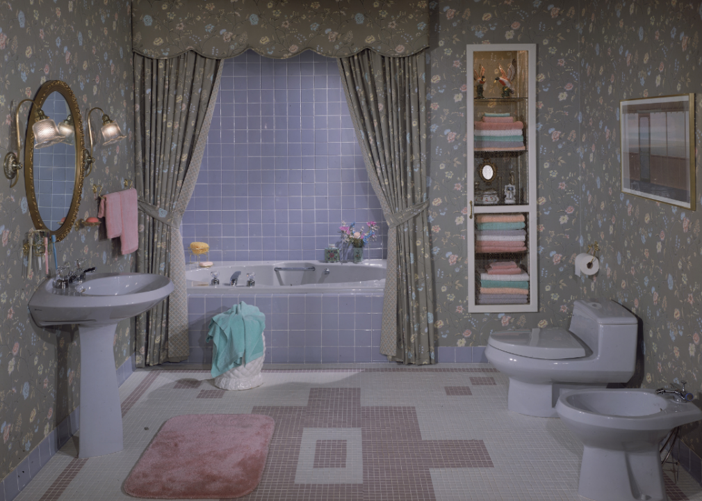
Pastel hues from pink to green to blue punctuated interior home design in the 1980s. This circa-1985 bathroom’s pastel floral motif on both the wallpaper and shower curtain complements the blue shower tile and matching pastel accent towel and bath towels.
Not only were pastels huge during the decade, but matching accents were also a critical feature of interior design. Mirrors, geometric shapes and patterns, and foiled wallpaper were also popular design choices. Technology had come a long way with intricate stereo systems and VCRs finally allowing viewers to watch movies at home whenever they wanted.
Dariusz Jarzabek // Shutterstock
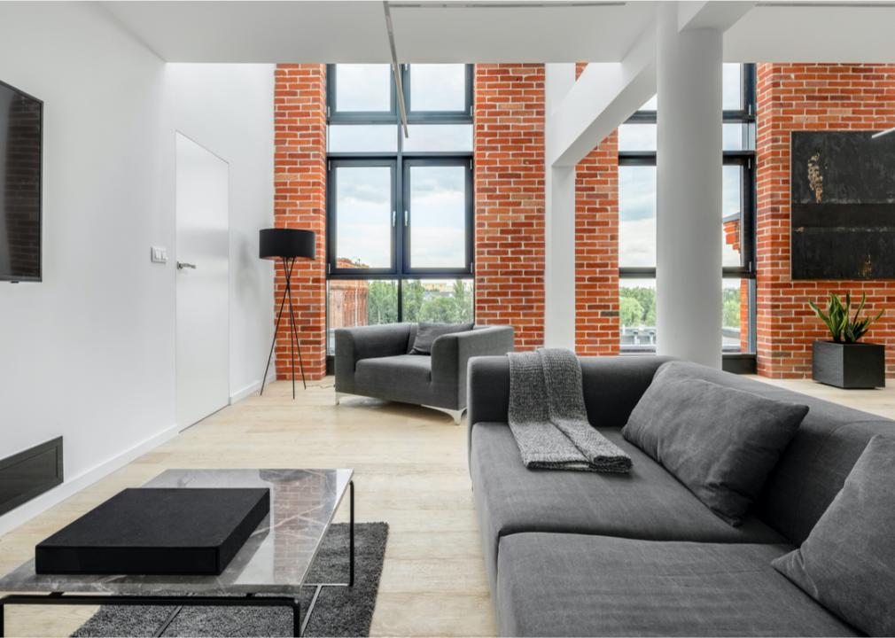
1990s: Minimalism
After the frenetic and fun 1980s, the 1990s seemed a lot slower and relaxed with the decade bringing a toned-down style that was neutral and simple. The minimalist vibe can be seen in this loft apartment featuring a living room with exposed brick walls, clean lines, and plenty of natural light thanks to floor-to-ceiling windows. Beige and gray color palettes added to the minimalism found in interior design.
For a bolder color choice, hunter green became popular in the 1990s. White kitchens, light-colored wood flooring, and pine furniture were simple design elements found in many homes. Japanese-influenced accents helped create a clean, uncluttered look while incorporating a more natural element.
Photographee.eu // Shutterstock
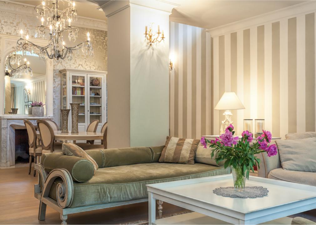
2000s: Shabby chic, vintage, and crystal chandeliers
The 21st century brought a return to vintage style. Shabby chic design featured well-worn furniture that looks faded and old in light colors like beige, light pinks, and creams. Shabby chic did not have to be old. Newer items could be distressed in order to give the item an antique look. Interior design elements featured old paintings with worn frames, vintage wallpaper, flowy white curtains in light materials, and large chandeliers. The beige lounge above features a light color palette of beige and creams with a variety of vintage and romantic elements including crown molding, a fireplace, wall sconces, and a crystal chandelier.
Photographee.eu// Shutterstock
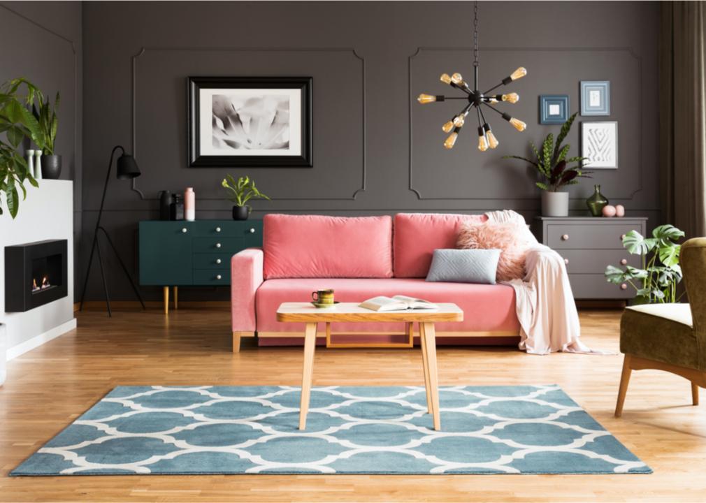
2010s: Millennial pink and brown
This image is a perfect example of 2010s interior design, with a wooden table against a blue carpet and a pink sofa in a gray living room. Pink against a darker color like brown or deep gray was a popular design trend found in many homes of the time. Mixed metal furnishings were also in vogue during the second decade of the 21st century.
Millennial pink often was used as an accent on a wall or a door so it popped and became a focal point of the room. The decade’s most popular design trends also included the chevron pattern, Scandinavian minimalism, and modern farmhouse, which featured antique furniture, shiplap, industrial fixtures, and a simple color palette of grays, whites, and blacks.
Followtheflow // Shutterstock
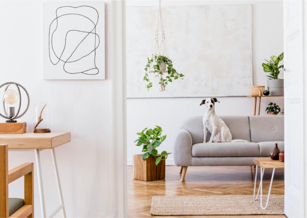
2020s: Defined spaces and natural materials
Natural materials like wood panelings and woven art and tapestries have earned a place in the interior design aesthetic of the 2020s. While the decade is still in its early stage, a turn toward environmentally friendly design has already begun. The image above features a modern boho interior with several natural elements including plants and a wooden desk and floors. Another important feature in home design will be a return to defined spaces.
Open-concept layouts became a difficult interior design trend during the coronavirus pandemic, which left people little flexibility while working. In the 2020s, people and designers have begun to explore ways to make spaces more functional with dividers or doors to separate work and living spaces.
This story originally appeared on Better
and was produced and distributed in partnership with Stacker Studio.


